Combo Box object
On the Graphics tab, in the Active Objects group, click Combo Box to select a single label from a combo-box list of labels.
If the list is longer that the space allotted, a scroll bar is enabled for the list. During runtime, if you select a label from the list, the combo-box hides itself and the selected label displays in the combo box.
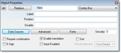
- Label text box: Type a string tag to receive the value of the label currently displayed in the combo box.
- Position text box: Type an integer tag, which corresponds to the label currently displayed in the combo box. Changing this tag value changes the label being displayed.
- Disable text box: Type a tag with a nonzero value to disable this combo box. Type a zero, or leave the field blank (default) to enable the Command animation. If you disable the combo box, it appears grayed out during runtime.
- Data Sources button: Click to open the Data Sources dialog box (see below).
- Advanced button: Click to open the Combo Box – Advanced dialog box:
Figure 2. Combo Box – Advanced

- Align combo-box: Click to specify the label alignment (Left, Center, or Right) which affects the alignment in both the combo box and its list.
- Color box: Click to specify a background color for the combo box. When the Color dialog box opens, click a color to select it, then click OK to close the dialog box.
- Drop List Size (Items) field: Specify the number of items that should be displayed at one time when the user clicks on the combo box. The higher the number of items, the longer the drop list will appear.
Note: If this number is less than the total number of items in the list, then the drop list will also scroll.
- Decimal Points: Select how decimal values will be displayed on-screen:
- Auto Format: Decimal values will be formatted according to the virtual table created by the SetDecimalPoints function.
- Custom: Enter the number of decimal places to display (e.g., 2) for all decimal values.
- Fonts button: Click to open a standard Font dialog box. Use this dialog box to change the characteristics of a message font.
- Security text box: Type a security level for the command (0 to 255). If an operator logs on and does not have the specified security level, the command becomes inactive. If an operator logs on and does have the specified security level, or you leave this field blank, the Command animation remains active.
- Require confirmation checkbox: Click (check) to prompt an operator to confirm a command during runtime.
- Enable translation checkbox: Click (check) to enable automatic translation of the combo box labels using the Translation Table.
- Sort checkbox: Click (check) to display the contents of your array of labels in alphabetical order. This parameter is available only when you select the Array Tag type.
- E-Sign checkbox: When this option is checked, the user will be prompted to enter the Electronic Signature before executing the animation.
- Input Enabled checkbox: Click (check) to allow an operator to select a label by typing the contents of that label into a tag in the Label field.
- Virtual keyboard: Virtual Keyboard type used for this object. You need to select the Virtual Keyboard option in the Viewer settings (Viewer on the Project tab of the ribbon) before configuring the Virtual Keyboard for this interface.
Data Sources
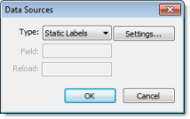
- Type combo box: Select the type of data source that you want to use, and the click Settings to configure the source. Each type of source is described in detail below.
- Field field (for Text File and Database only): Specify which field/column of the data source to read from.
- Reload field (for Text File and Database only): Enter a tag name. When the value of the specified tag changes, the combo box will reload the labels from the data source.
Type: Static Labels
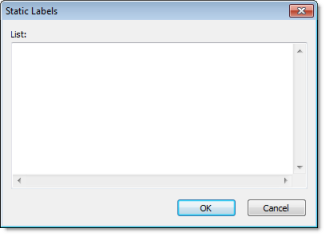
Enter your labels — with one label per line — just as if you were editing a plain text file. You can include tags or expressions in a label by enclosing them in curly brackets. For example: Tank #1 in area {AreaNameTag}.
The labels are not sorted in any way, so be sure to put them in the order you want them displayed during runtime. The first line is position 0, the second line is position 1, and so on.
Click OK when you’re done.
Type: Array Tag
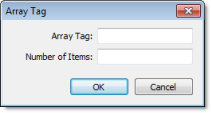
- Array Tag: Enter the name of a String array that contains the items for the combo box.
- Number of Items: Specify how much of the array should be displayed in the combo box. Keeping in mind that the combo box counts array index 0 as the first item, if you enter a value of 4, then the combo box will display array index 0 through array index 3.
Click OK when you’re done.
Type: Text File
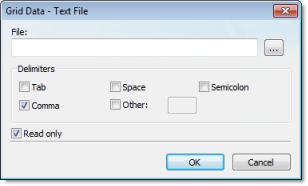
- File: Enter the name of the text file source. You can either type the file name and its path or click the … button to browse for it. (If the file is stored in your project folder, then you can omit the path in the name.)
Tip: You can configure tag names between curly brackets (e.g., {tagname}) in the File field.
- Delimiters: Set the delimiter(s) used in the data source file. For instance, if the data will be read from a CSV (comma separated values) file, you would select the Comma option. You can even choose a custom delimiter by checking the Other option and typing the custom delimiter in the field beside it.
Click OK when you’re done.
Type: Database
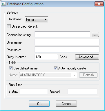
For more information, see Database Configuration.